The 9 Best Spring Colour Palettes to Freshen up your Home in 2024

The 9 Best Spring Colors to
Freshen up your Home in 2024

Spring brings with it a range of colors that inspire and enliven the world of interior design. Our guide to the 9 best color palettes for spring showcases the most enchanting colors for spring, from soft, calm pastels to bold, vibrant hues. This selection is designed to transform your space and reflect the beauty and freshness of the season. Harness the power of the spring palette to refresh and revitalize your home with the season’s best trends.

The Spring Color Palettes and How they look in every Room

Soft Pastel Tones

The Soft Pastels palette is reminiscent of the first blush of spring and offers a delicate color palette of soft pinks, baby blues, soft lavenders and mint greens. These shades capture the essence of spring’s delicate blooms and create an atmosphere of serenity and calm. This palette is ideal for rooms where a subtle accent of color is desired. It soothes the senses and brings calm to the home.

Bright and Bold

This palette celebrates the vibrant energy of spring with bold and vibrant hues such as fuchsia, lemon yellow and electric blue. These colors are perfect for adding dynamism and vitality to rooms and reflect the vibrant spirit of the season. Ideal for accent walls, statement pieces or decorative accents, this palette will transform any room into a vibrant and energetic space.

METAL WALL ART THAT COMPLEMENTS THE BRIGHT AND BOLD SPRING COLOR PALETTE

Earthy Neutral Tones

Inspired by the rebirth of nature, the Earthy Neutrals palette includes warm terracotta tones, rich beiges, soft grays and mossy greens. This palette brings a sense of stability and calm to interiors through its connection to the natural world. It is perfect for anyone who wants to bring a piece of nature into their home and create a cozy, nature-inspired retreat.

HAND-PAINTED IMAGES THAT COMPLEMENT THE EARTHY, NEUTRAL SPRING COLOR PALETTE

Floral Inspirations

This palette picks up on the bright colors of spring’s floral splendor and contains peony pink, daffodil yellow, hyacinth violet and poppy red. It was developed to fill rooms with the cheerful energy of spring flowers and create a dynamic and inspiring atmosphere. This palette is ideal for adding bright color accents with accessories, textiles or wall art to liven up any interior.

WALLPAPERS WITH FLORAL INSPIRATIONS

Cool and Refreshing

The Cool and Refreshing palette reflects the fresh, crisp mornings of the season and includes sky blue, sea foam green, cool purple and light aqua. These colors convey a fresh and airy feeling that is invigorating and calming. Perfect for bedrooms and bathrooms, this palette brings a breath of fresh air into the home, reflecting the rejuvenating quality of spring itself.

HAND-PAINTED IMAGES THAT COMPLEMENT THE COOL AND REFRESHING SPRING COLOR PALETTE

Sun-Washed Tones

This palette captures the muted beauty of spring with colors like coral, peach, soft yellow and faded denim. These faded hues convey a nostalgic and warm feeling reminiscent of the soft sunlight of spring afternoons. This palette is ideal for creating cozy, inviting spaces and adds a touch of understated elegance and warmth.

HAND-PAINTED IMAGES THAT COMPLEMENT THE SPRING COLOR PALETTE - SUN-WASHED TONES

Monochrome Shades of Green

The palette of monochrome greens ranges from bright lime green to deep emerald green and soft olive green, celebrating the lushness of new foliage. This palette captures the vitality and growth of spring and brings a vibrant and natural energy to interior design. It is so versatile that it fits into any room and enriches it with the freshness and vibrancy of green.

METAL WALL ART THAT COMPLEMENTS THE SPRING COLOR - MONOCHROMATIC SHADE OF GREEN

Tropical Brightness

For those looking for an adventurous and exotic touch, the Tropical Brights palette offers hot pink, turquoise, sunny yellow and lime green. These exuberant colors add a bold and vibrant feel to interiors and are perfect for spaces that make a statement. Ideal for accent or themed rooms, this palette promises a cheerful and energetic atmosphere.

tropical bright spring colour palette in a kids playroom
PAPER WALL DECORATION THAT COMPLEMENTS THE TROPICAL SPRING COLOR OF A CHILD'S ROOM

Neutral Pastel Shades

With a blend of soft pastels and elegant neutrals, this palette creates a sophisticated and calming ambience. With shades of pale pink, soft taupe, pale gray and pale lavender, it offers a sophisticated approach to spring colors. This palette is perfect for rooms looking for a refreshed and calm atmosphere with a touch of modern elegance.

Brighten up your Home with these Spring Color Palettes

Each of these springtime color palettes can be adapted to different interior design styles, from modern minimalism to cozy country style. The key is to incorporate these colors in a way that reflects the personal taste and functional needs of the space, whether through paint, textiles, accessories or artwork. Incorporating the colors of spring into your interior design will not only bring the space up to date with the season, but will also improve mood and well-being and make your home a welcoming place.

FAQs - Frequently Asked Questions

To incorporate spring’s color palette into a small space, focus on light and airy colors such as soft pastels or cool and refreshing tones. Choose accent pieces such as pillows, vases or artwork that bring in spring colors without dominating the room. Mirrors and reflective surfaces can also help to diffuse the light in the room, making it appear larger and brighter while picking up on the spring theme.

Mixing different spring colors in a room can create a dynamic and harmonious look. Start with a neutral base from the earthy neutrals palette and add pops of color from the bright and bold or floral inspiration palettes with accessories, textiles and wall art. Create balance by choosing one or two dominant colors and using others as accents so the room feels cohesive and not too cluttered.

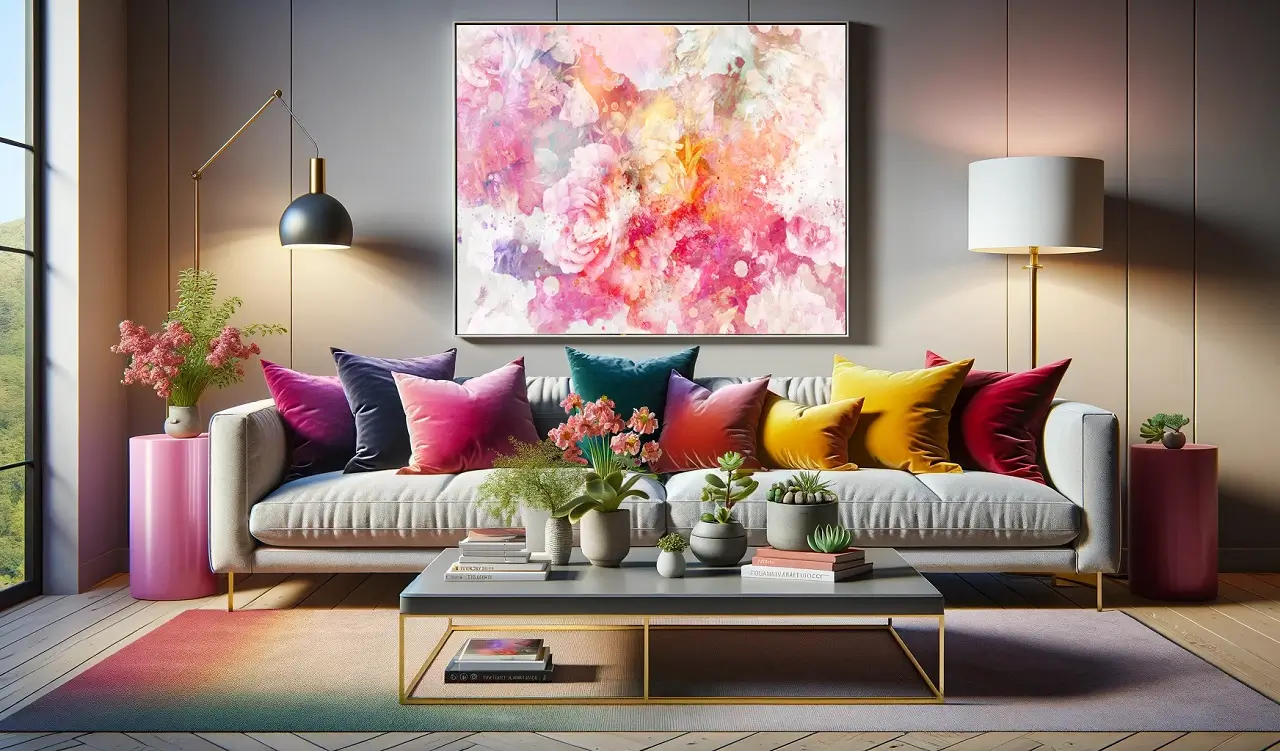
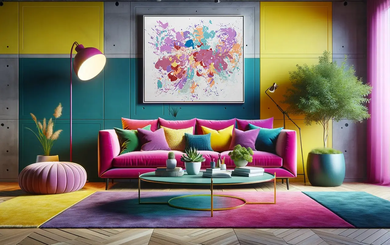
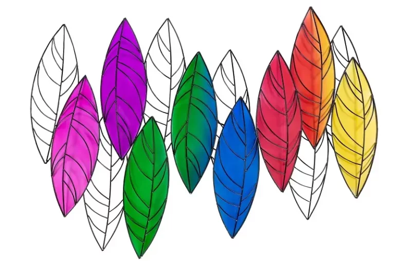
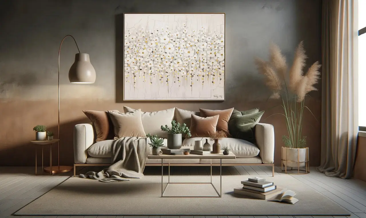
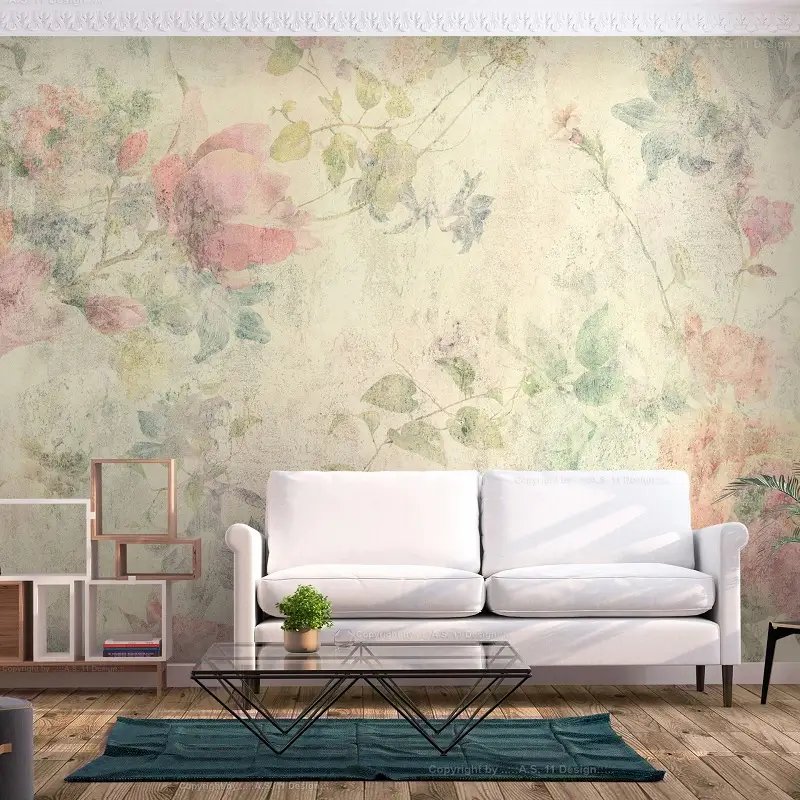
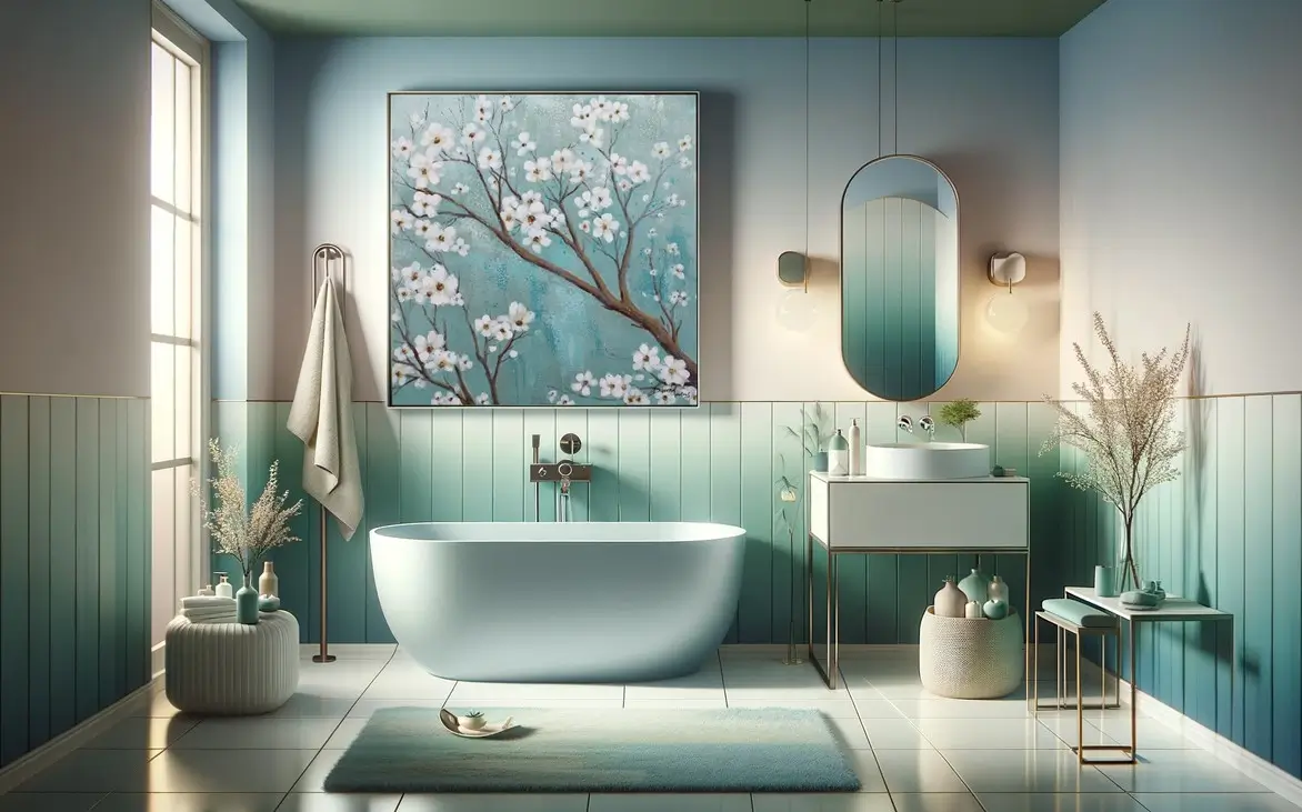
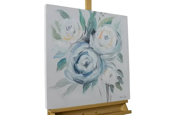
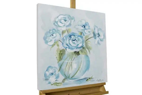
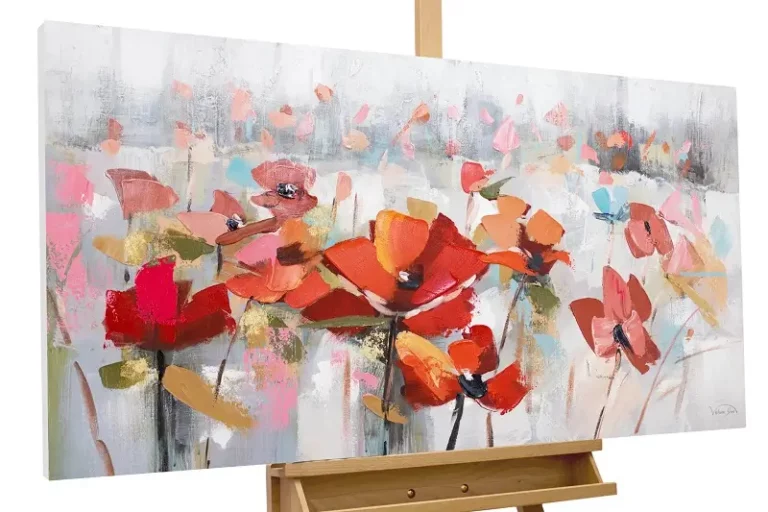
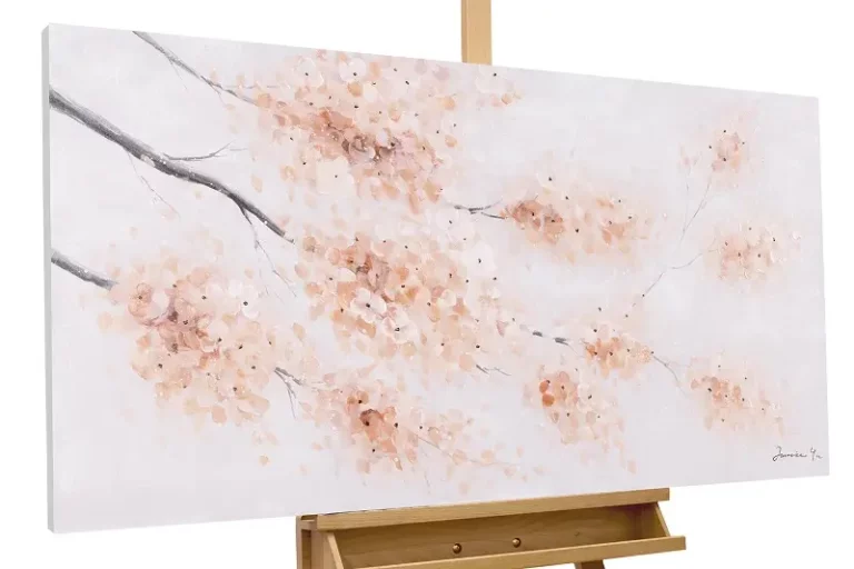
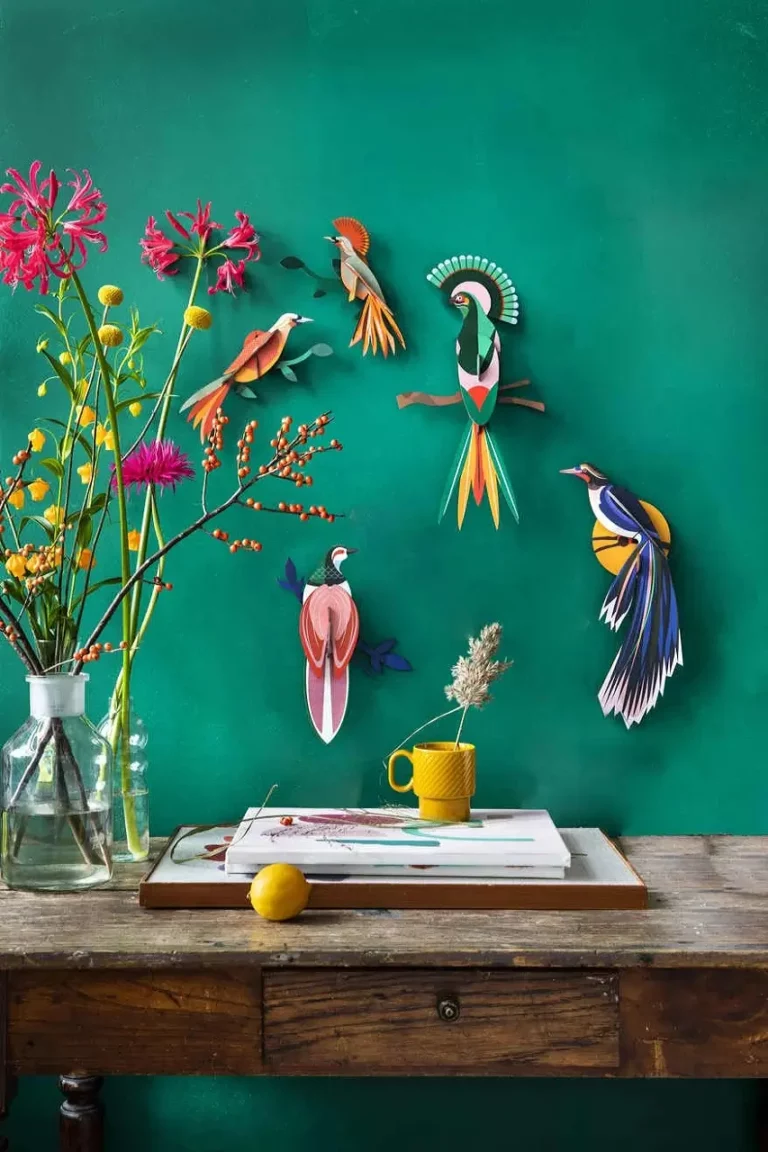
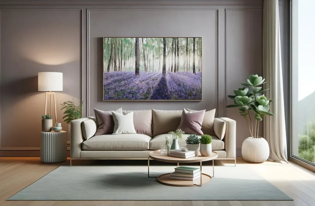
Yes, spring colors can be used in any interior design style. In modern and minimalist interiors, monochromatic greens or pastel neutrals can add subtle vibrancy without clashing with clean lines. In more traditional interiors, floral inspirations or tropical, bright palettes can add depth and character. The key is to match the colors to the existing furnishings and use them in a way that complements the overall aesthetic of the design.

FOLLOW US ON ALL OUR SOCIAL MEDIA ACCOUNTS

Picture Credits: @KunstLoft